


Polishpavilion by The design team: Wojciech Kakowski, Natalia Paszkowska, Marcin Mostafa
CONCEPTUAL DESIGN FOR THE POLISH EXPO 2010 EXPOSITION PAVILION
THE PROJECT CONCEPT
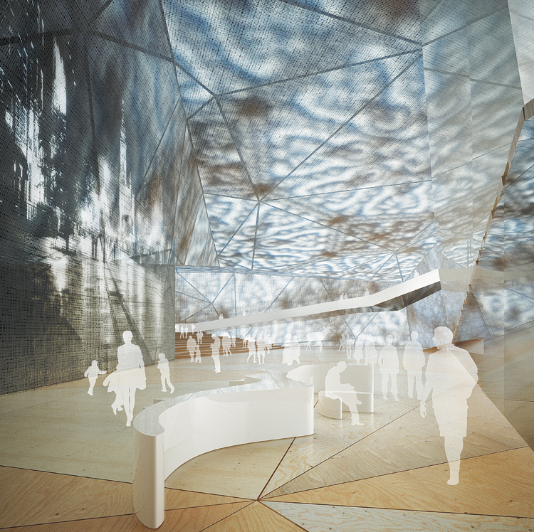
In the contemporary world with its abundance of visual experience, with the pictorial language of communication reigning supreme, with the almost unconstrained and instant accessibility of iconographic material, an exposition piece of architecture will only be attractive insofar it can offer perceptual sensations attainable only through direct, unmediated exposure to out-of-the-ordinary, singular stimuli, insofar it can provide a quality of experience born out of the chemistry of inter-sensory stimulation. Given the nature of the exposition, the exhibition facility has to denote, by its esthetic distinctiveness, the country of origin, has to constitute, by the strength of its stylistic connotations, an evocative, recognizable and memorable cultural ideogram. In our design, the cultural idiom is primarily conveyed through the theme, the motif of folk-art paper cut-out. Or, more precisely, through a rendering of the motif, a transcription of an elementary esthetic code into the contemporary language of architectural décor. The transcription rationale was twofold. First of all, we did not wish the design to be literally folklorish, a mechanical multiplication of convention-approved set patterns. The intention was for the structure décor to draw on and make reference to tradition, but ultimately to be that tradition’s contemporary reinterpretation, a creative extension into the present day by way of inspiration rather than replication. Secondly, we aspired to make the structure in its own right, in a purely architectural dimension, a significant landmark, a showcase of Polish design achievements. That it should be an attractive, eye-catching exterior both in daylight, against the panorama of other Expo facilities, as well as a mesmerizing experience at night with the edifice drawn by the multi-colored light seeping through the cut-out patterns. And reversely, that it should provide inside visitors with comparable experience by shaping the outer skin patterning in such a way that the sun rays shining through would chisel, by light and shade, the space under the vault. The structure’s overall shape, with many slanting planes, on the one hand complements and rounds out, by the suggestion of a folded sheet of paper, the ‘cut-out’ narrative, on the other creates inside a geometrically intriguing and flexible space that can be creatively apportioned, by inner divisions, to different exhibition, performance and utility functions and uses.
'REF. > Architecture' 카테고리의 다른 글
| [Shop] World Business Center Busan (0) | 2008.10.10 |
|---|---|
| [ Querkraft ] Museum Liaunig (0) | 2008.10.10 |
| [ ANTOINE PREDOCK ] MESA DEL SOL TOWN CENTER (0) | 2008.10.09 |
| [ ARX ] Barreiro College of Technology (0) | 2008.10.09 |
| [FdM:Arch] OneTwo Townhouse (0) | 2008.10.08 |