728x90

Simply continuing the structure found on the ground onto the facade does not always work out fine, as the Thiais Bus Center by EDCM proves. In the name of contextuality all differences can be erased, like the overuse of the blur-tool in Photoshop.
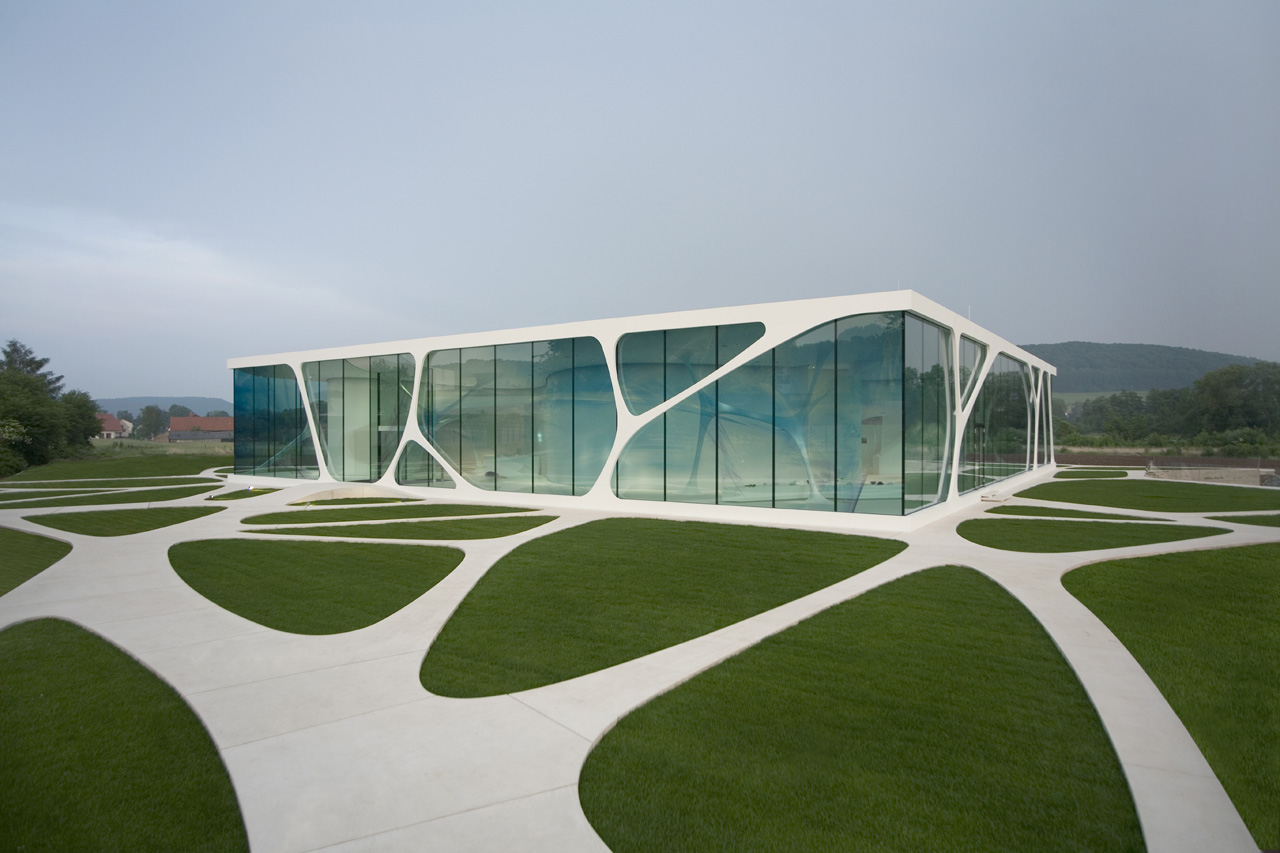
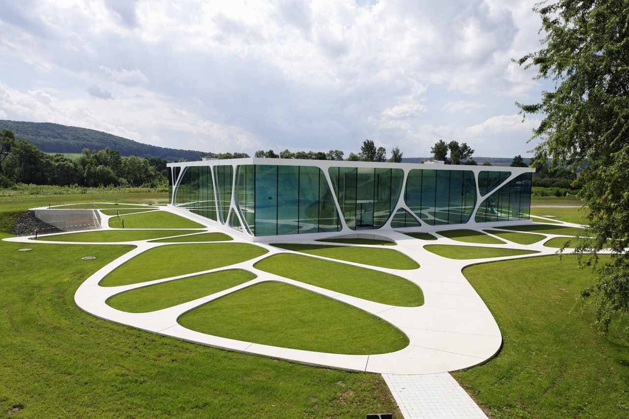
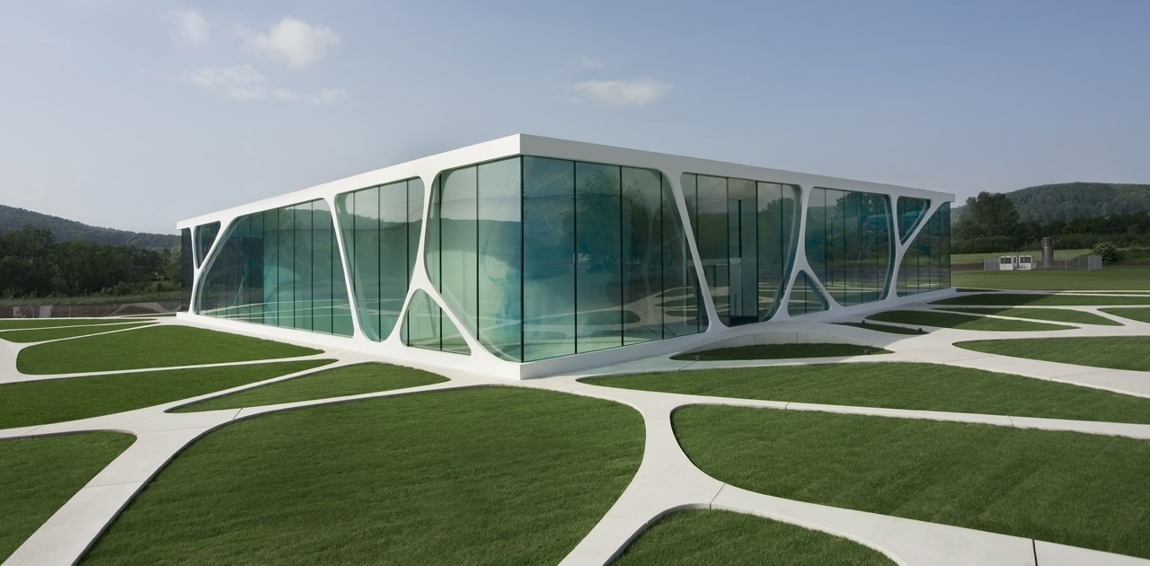
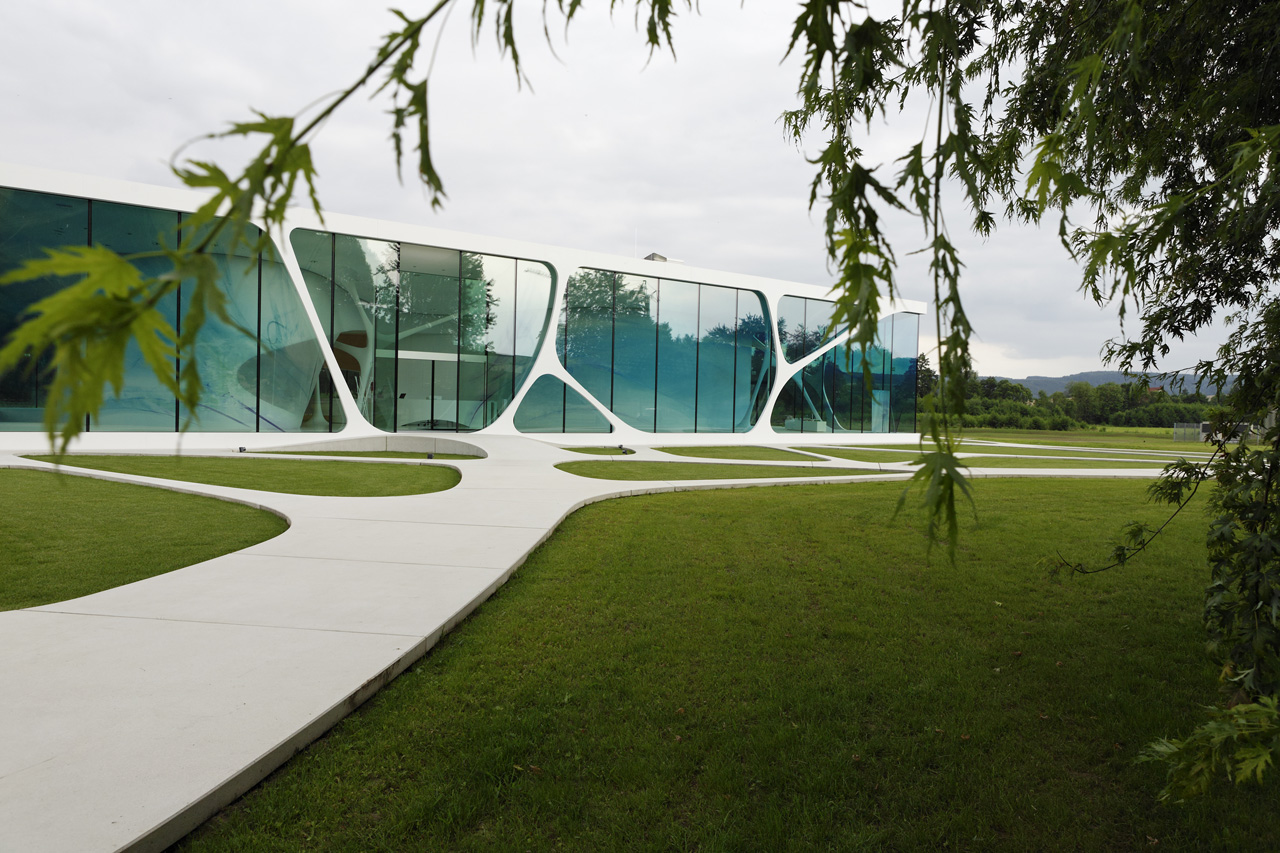
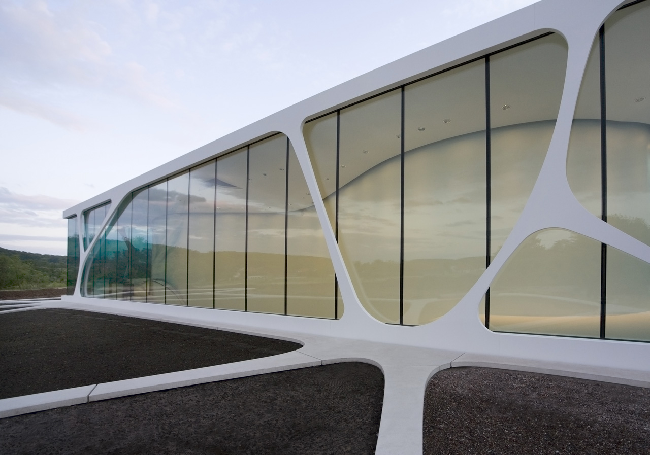
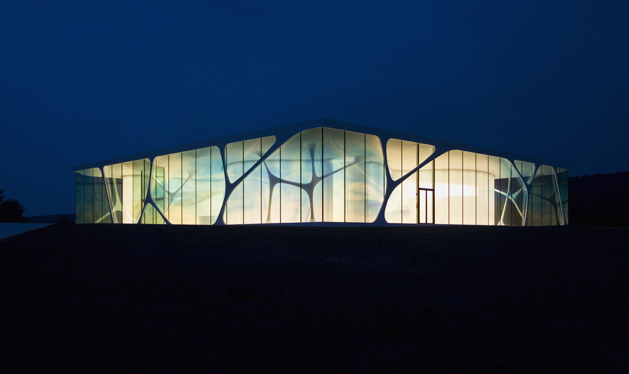
Instead, this pavilion by 3deluxe somewhere outside the village Bad Driburg in Germany maintains the difference between ground and architecture, while at the same time bind them together firmly. Fascinating in that sense is the plinth at the point where the facade hinges into the pavement. Quite a contrast to the fashion to make buildings appear like they are floating above the ground ? no, this pavilion stands its ground.
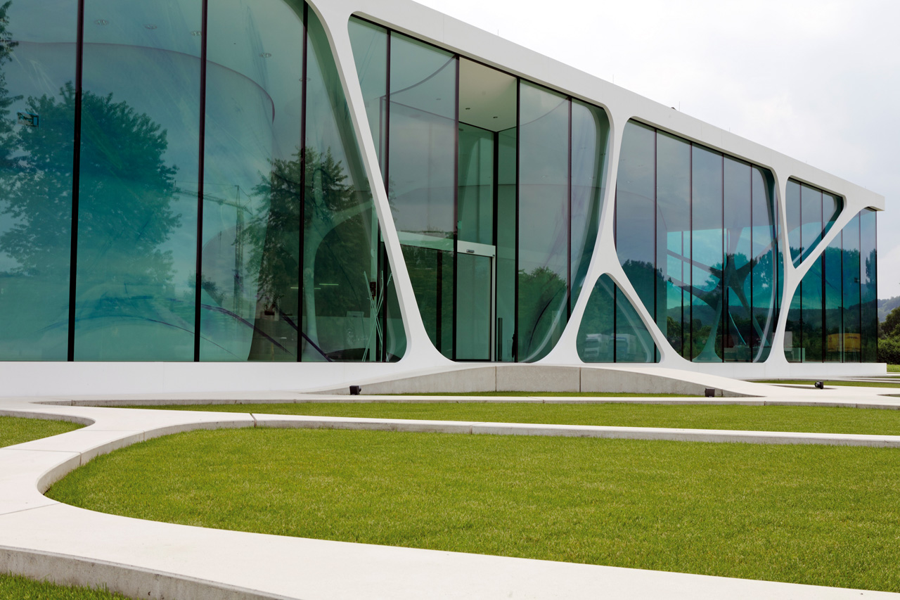
It somehow makes sense to continue walking paths as columns. I suppose it is because of the high degree of M.C. Escher to the project: We imagine walking the columns. It brings a nice tension to the architecture. Fantasy.
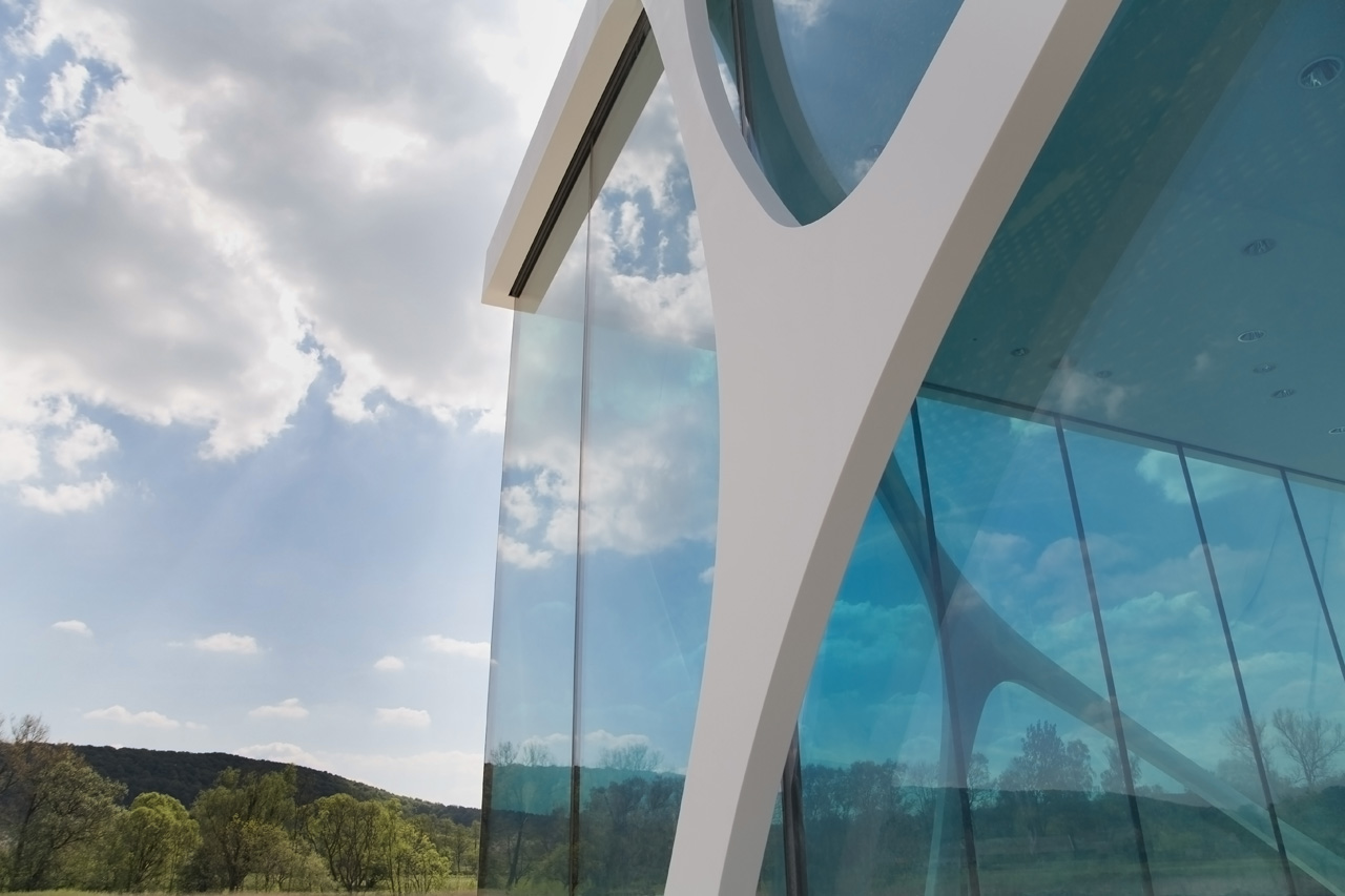
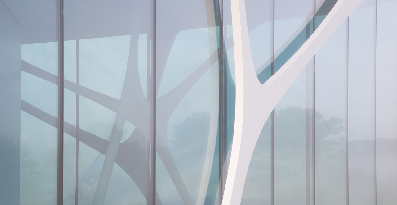
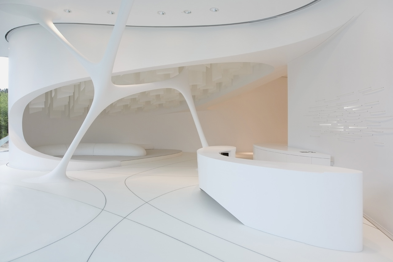
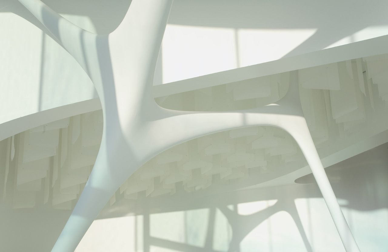
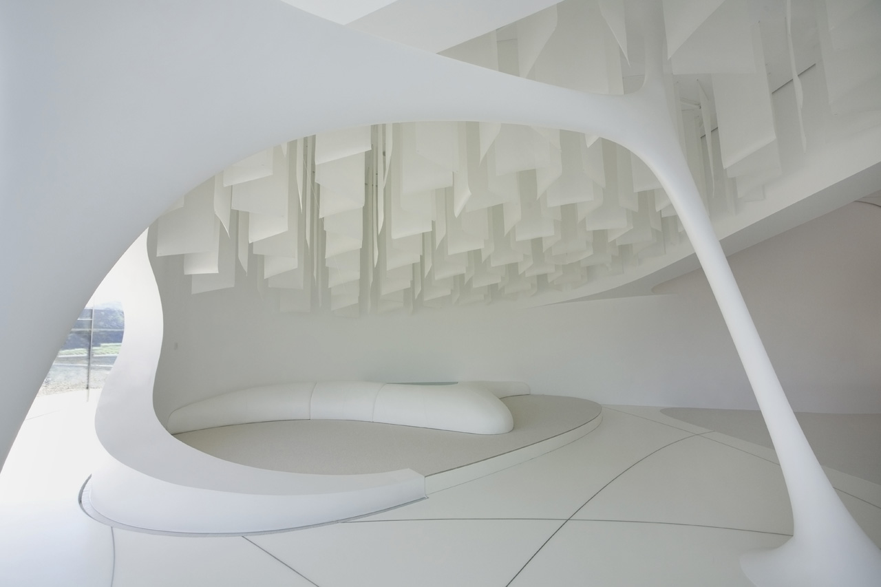
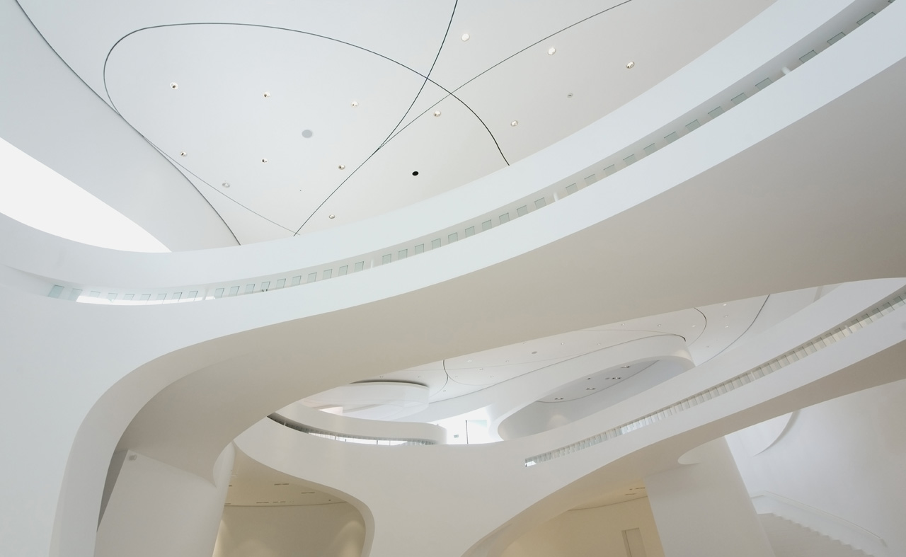
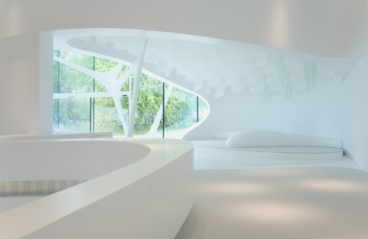
More tension comes from the dialogue between the flat structure of the facade and the three-dimensional structures in the interior. They are just unbelievable beautiful. It is sculpture. How did they make this? A peak at the drawings learns these ‘tensile fluids’, as I would call them, are hollow except for a central rod. A bit unfortunate, the fluids don’t keep the building up.
As I know the architects will be reading this, I will add to all this flattering also three suggestions for improvement:
1. You suggest the building is oriented equal to all sides: In plan it is a perfect square, and the paths surround the building. But there are only two entry points, not four. And the paths encircle the project only to a perimeter of what, thirty meters? I know, budget, client, but still… you came close, but just missed perfection.
2. Then the ceiling. While the structure at the facade is slender, very slender, the ceiling behind the glass paneling folds downwards like a fat construction worker (Dutch research this week proved construction workers are fatter than average). Why such a contradictory language?
3. Finally. For me this project has a raw kind of abstraction to it. It then hurts to see the field around the building planted with… grass. Green, smooth, tidy grass. What about something just a little less banal? Like heath, or gravel.
Just to tease you guys. These are only details, and only whiny personal suggestions. Nothing significant.
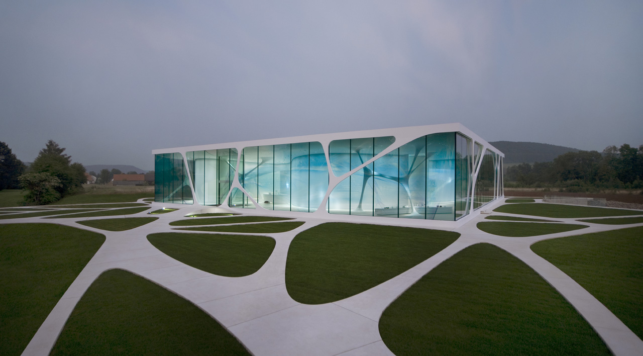
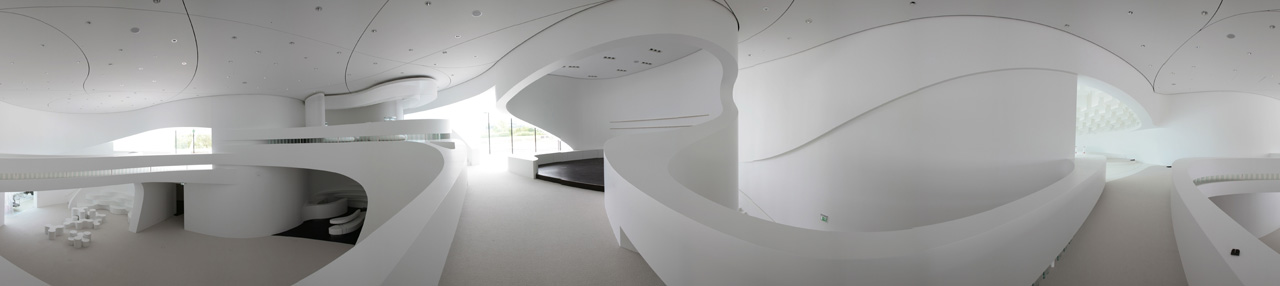
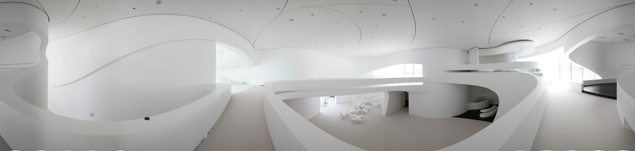
But the panorama perspective is deceiving as it compresses the rounded forms. After that image the unmediated reality is quite a disappointment. One kind of wishes one could walk around in the panorama photograph.
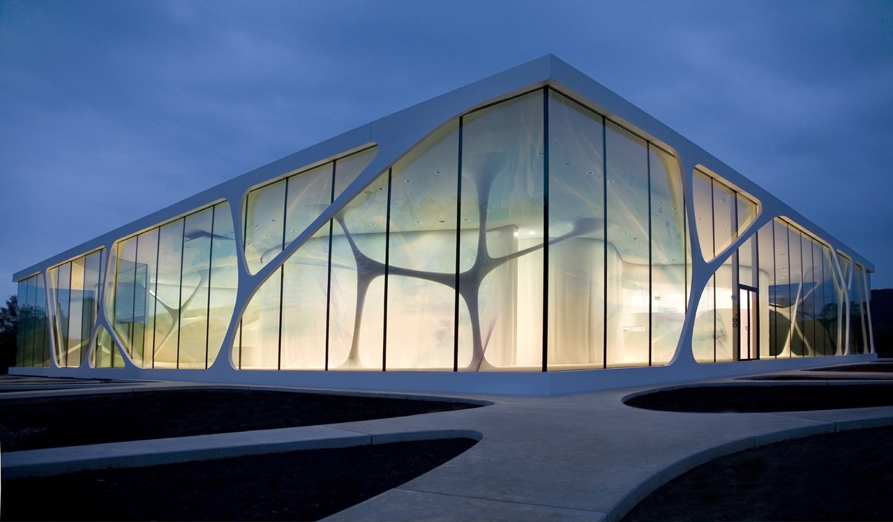
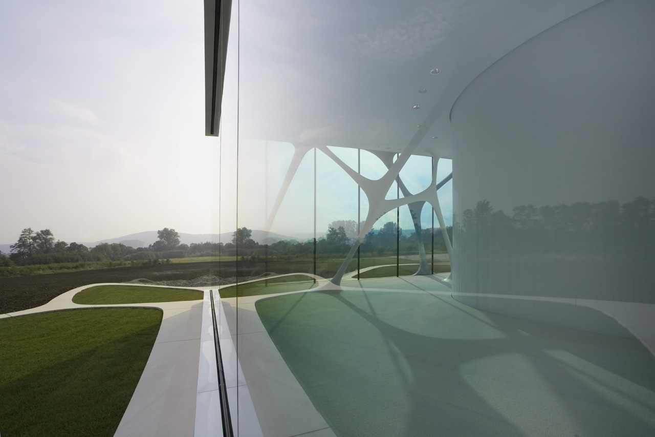
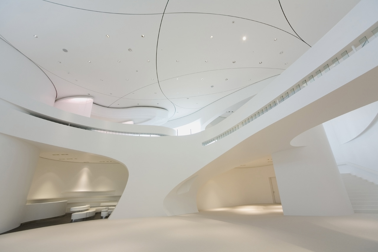
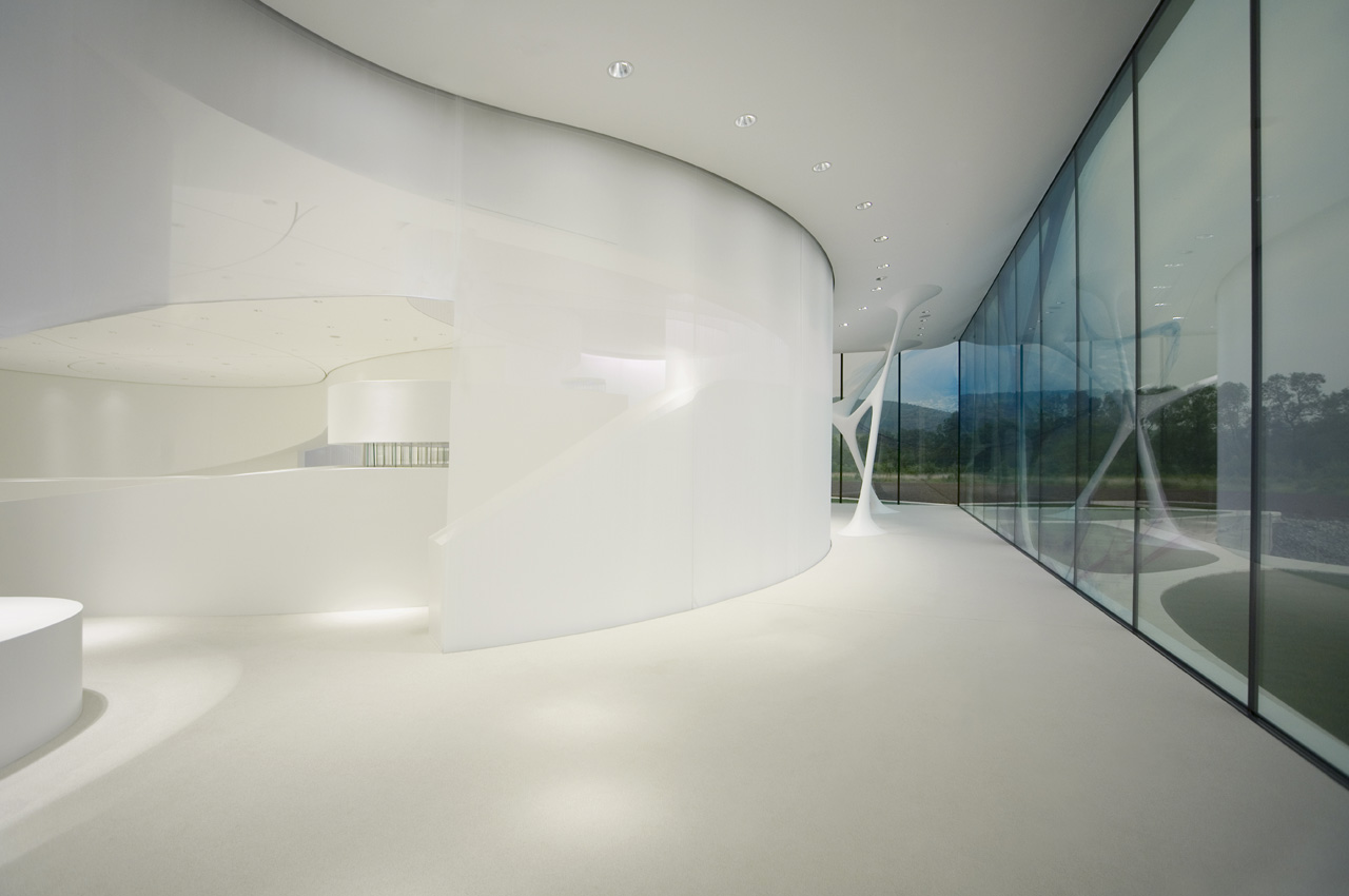
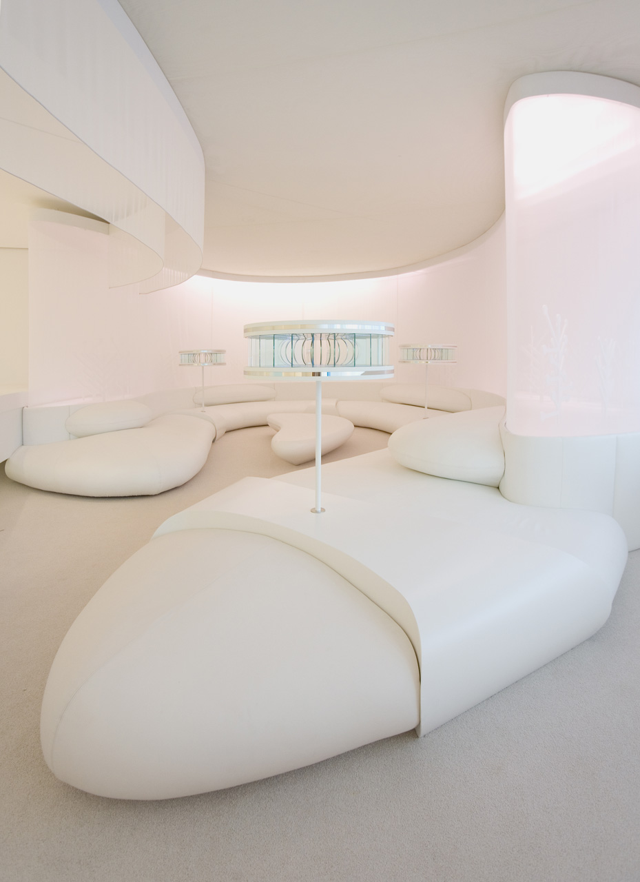
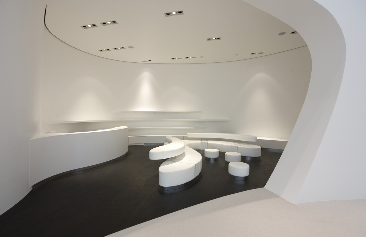
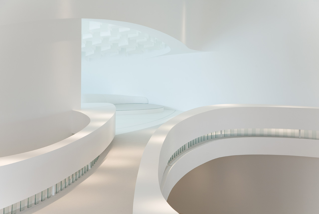
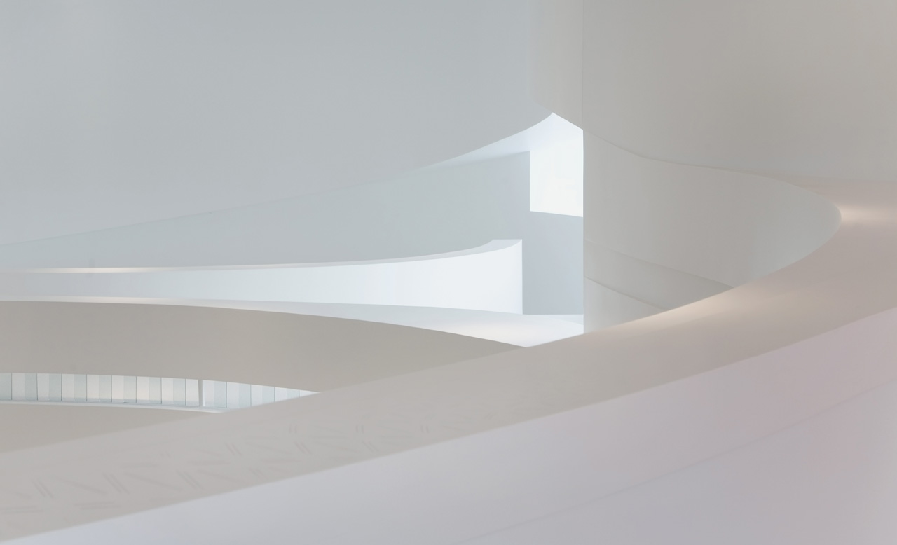
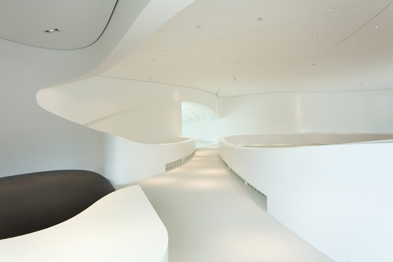
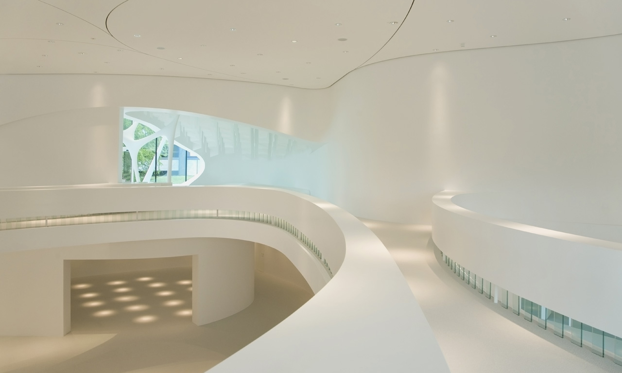
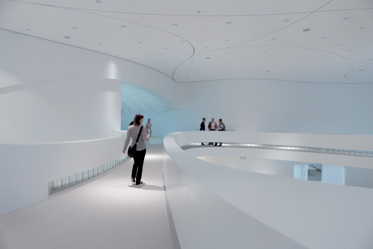
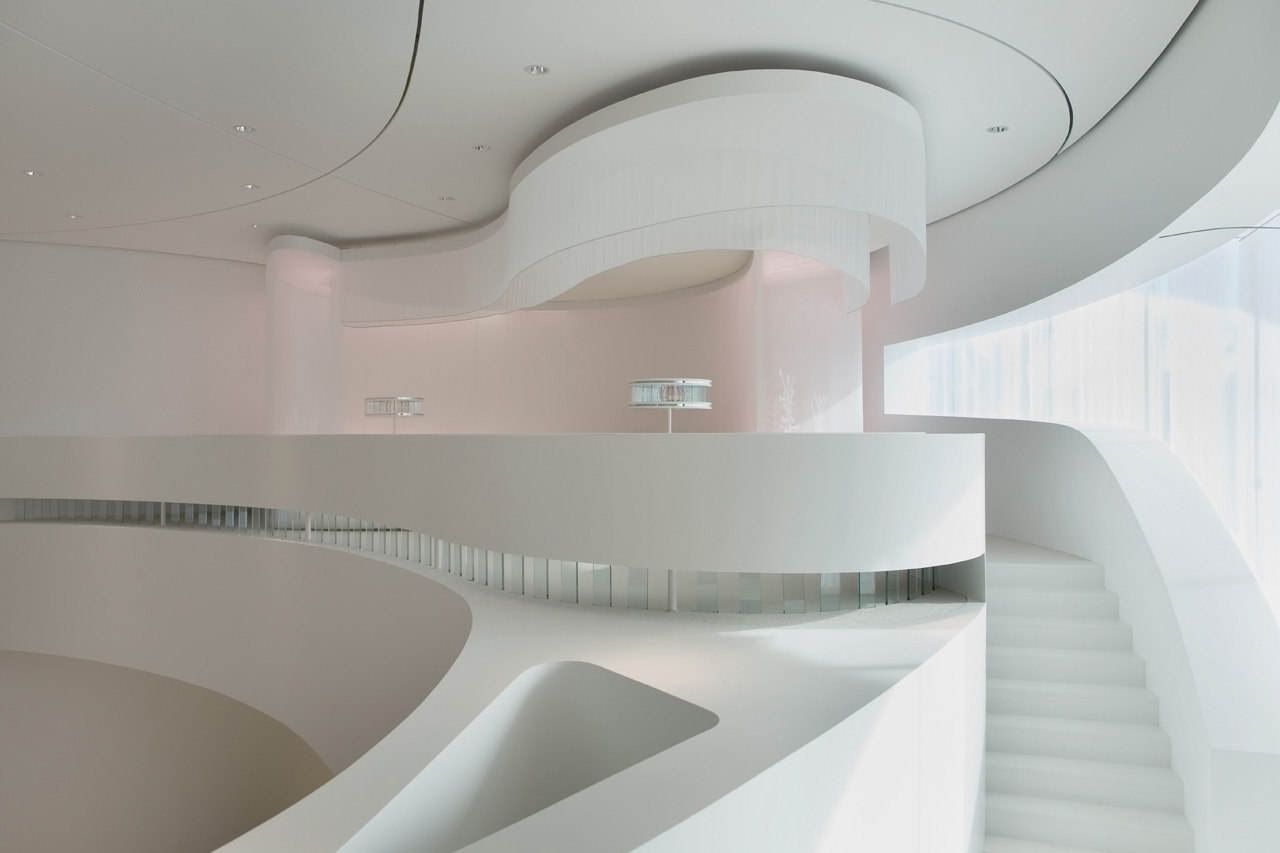
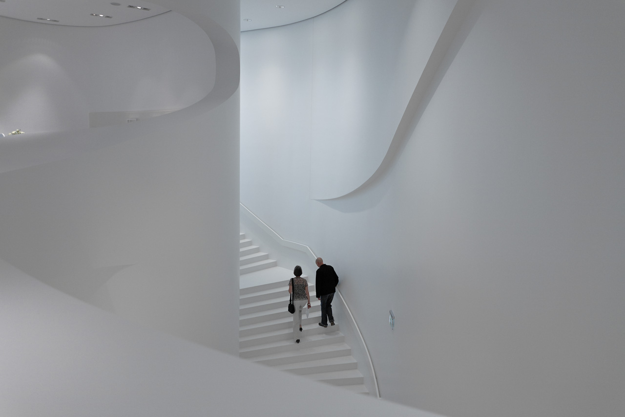
And that while the interior has been designed with great care, with great means. It is so dynamic! Everything curves and flows into each other. It seems there is no rectangular piece left. Except for the floor then.
In contrast to the exterior, there is however also a very upfront sense in its styling the interior is quite old-fashioned. Already in 1962 Eero Saarinen for instance build his TWA Flight Center at JFK Airport in New York, which applies the similar flowing forms. Architects add value by relating to contemporary culture, I recall Michiel Riedijk saying a couple weeks ago. It is an idea that ? at least in the Netherlands ? popped up around 1850. But it still makes sense.
I also keep pondering why it has all been painted white. The blurring between building and surrounding landscape is nothing compared to the blurring of all the white. Where are the accents, the graphics, the patterns, the ornaments? There is no shadow either. Only blinding light from the surrounding glass facade.
The level of detailing and formal freedom shown in this project sure is stunning. But the level of control over the matter, is absent in the control over the architecture; the experience of the space, and the relation to contemporary culture.
그리드형
'REF. > Architecture' 카테고리의 다른 글
| [ Dorte Mandrup Arkitekter ] Summerhouse in Jørlunde (0) | 2008.10.04 |
|---|---|
| [ Zaha Hadid ] Guangzhou Opera House, China (0) | 2008.10.04 |
| [René van Zuuk Architekten] Spikvoorde II (0) | 2008.10.03 |
| [ J. MAYER H ] Mensa Karlsruhe (0) | 2008.10.03 |
| [ Vitruvius ] Barcode (0) | 2008.10.03 |