This
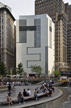
weekend the Museum of Arts
and Design opens the doors of its new home at 2 Columbus Circle following
an extensive redesign of the building by Brad Cloepfil of Allied Works
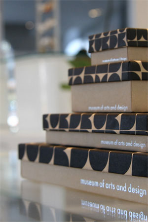
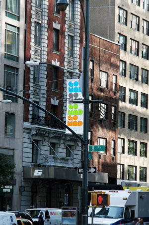
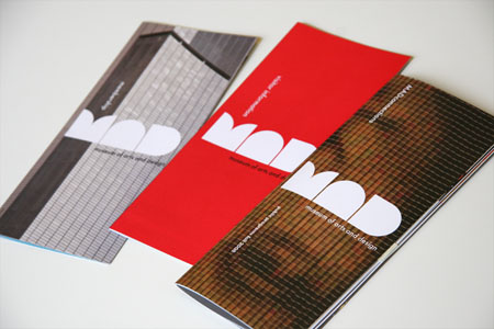
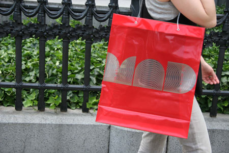
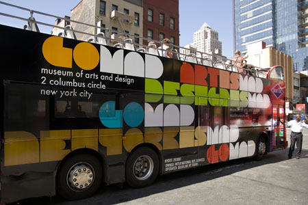
Architecture. The museum’s new graphic identity can already be seen
throughout the city, on the sides of buses, on street banners, in print ads and
in the subways. The geometric-based mark reflects the circles and squares
present in the building’s shape; its location, on Columbus Circle; and the
building’s iconic “lollipop” columns retained in the redesign. After the jump
Michael Bierut discusses creating a graphic identity for the one of New York’s
most anticipated reinventions.
Prior
to 2002, the Museum of Arts and Design was called the American Craft Museum; it
changed its name to accommodate the growing scope of its collection.
Discussions of what is craft and what is art and design aside, the MAD acronym is a great asset. It’s short, pronounceable and
memorable. But it’s also in some ways overly familiar. For example, there
already is a well-known MAD logo, which appears on the
cover of a magazine
that I loved when I was twelve. So part of our design problem was to make it
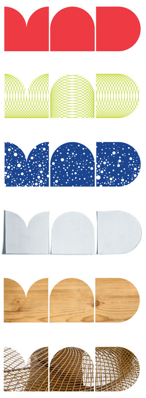
surprising, less familiar, and proprietary—to come up with a MAD
that could only be the Museum.
We
also wanted a way of writing the name that could embody the values of the
Museum, something that seemed inventive and surprising, and that could appear
in different ways on different occasions. The Museum, after all, is dedicated
to artists who take typical forms—say, vessels, or chairs—and transform them
over and over again. We hope that the simple forms of the new logo will permit
just that kind of transformation.
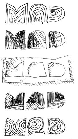
We tried a
lot of different things along the way, including changing the acronym
altogether. At one point, we developed an interesting linear version that
echoed the ingenious system of connected light slots that Cloepfil designed in
the walls, floors and ceilings of the gallery spaces. In the end, we decided to
start with MAD’s fantastic location. It’s a more or
less square building that sits on the most prominent circle in Manhattan. By
combining squares and circles, we came up with an alphabet that rendered a great
MAD monogram. Some people who see it are reminded of
Edward Durrell Stone’s famous—or infamous—”lollipop” columns, which Brad and
his team have retained as “ghosts” visible from outside the building.
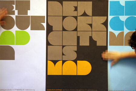
We then
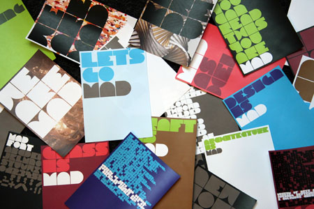
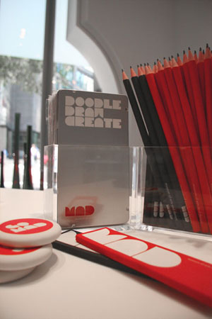
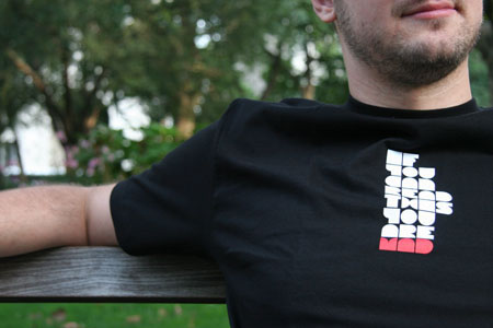
designed an entire alphabet and numbers based on the basic MAD
combination and again, made out of squares and circles. We call it MAD Face. It’s fun but, as one can imagine, not the easiest
thing to read. It doesn’t work too well on fire exit signs, for instance. But
it definitely reflects the inventive spirit of MAD, and
we use it in the advertising campaign and on special occasions. A more
conventional typeface, Futura, is used in print applications and signage. Like
the logo, it is also based on geometry, with a perfectly round letter “o.”
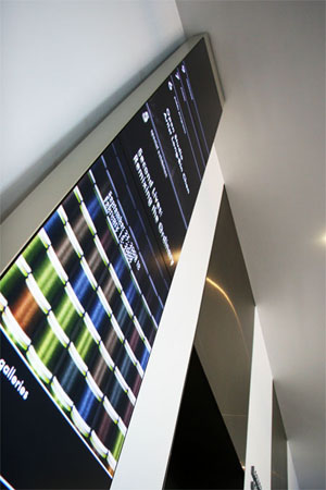
Lisa Strausfeld
and her team have created a program of dynamic digital media for the Museum
that includes animated totems that will serve as directories to the various
floors of the Museum, screens facing the sidewalk that will let passersby know
what’s happening inside, and interpretive kiosks with interactive databases
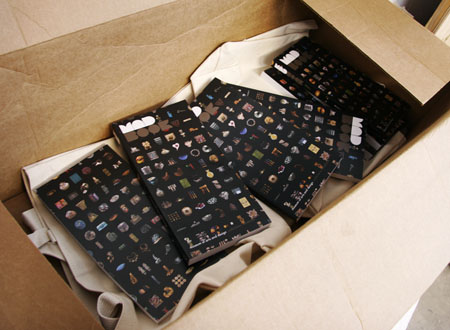
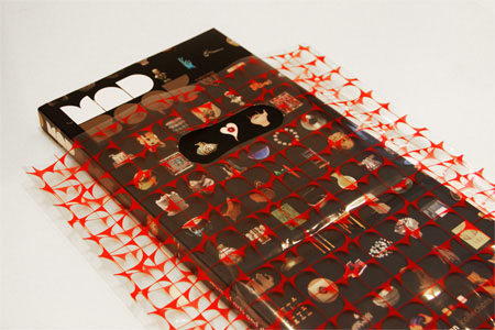
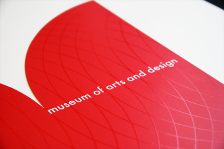
that will let you explore the collection. Pattern is a major element of the
identity, as it is for the art, and Lisa’s media presents shifting pattern of
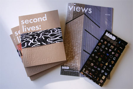
objects from the collection. We’ve co-opted this pattern for the cover of the
museum catalogue, MAD Book.
Identity, Typeface, Collateral, Exhibition Catalogs,
Products, and Advertising:
Michael Bierut and Joe Marianek
Signage, Wayfinding and Exhibition Graphics:
Michael Bierut, Rion Byrd-Gumus and Kai Salmela
Dynamic Media:
Lisa Strausfeld, Christian Marc Schmidt, Kate Wolf and Christian Swinehart
Identities, Signage, Recent Work, New York, Michael Bierut, Lisa Strausfeld, Typography
09 / 26 / 2008 | Permalink
'REF. > Debris' 카테고리의 다른 글
| [ Richard Galpin ] Peeled Architecture (0) | 2008.10.05 |
|---|---|
| [ boris hoppek ] I won’t fuck with you tonight (1) | 2008.10.01 |
| [ NL Architects ] Virtual Realities (0) | 2008.09.14 |
| [ noriko ambe ] works (0) | 2008.08.19 |
| [AOC] Polyopoly (0) | 2008.07.09 |