
 |
 |
 |
Neri&Hu Design and Research Office-Recast – Lao Ding Feng Beijing
과거와 현재. 오래 기억을 갖고 있는 공간을 재구성한다는 것은 기존시간에 대한 존중으로 부터 시작된다.
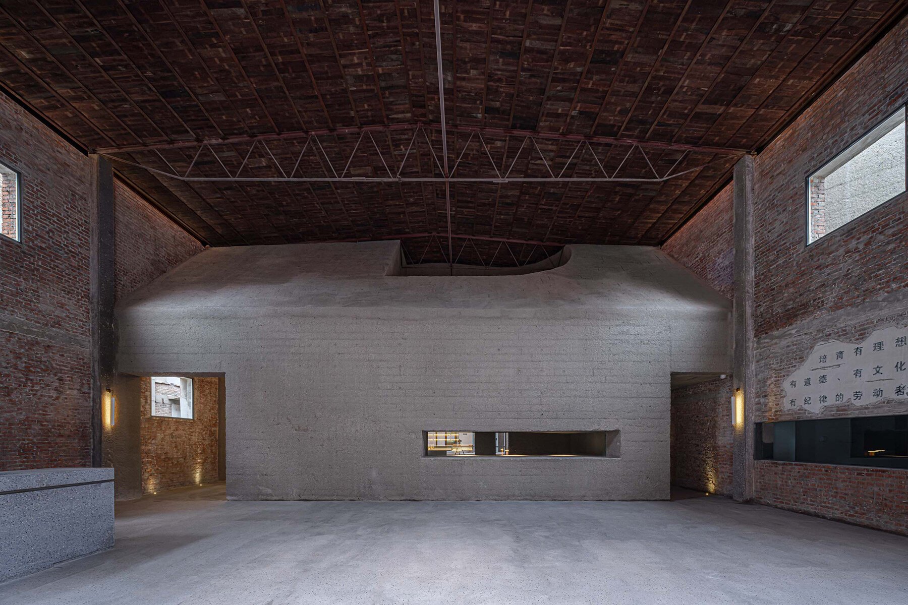
여기, 네리후드의 복원작업은 기존 직물공장; 메인 창고와 3개의 별채로 구성된 공장을 내부 정원과 리테일샵, 갤러리 및 사무공간으로 탈바꿈 시킨다.


neri&hu whisks inspiration from chinese baked goods for brick and concrete pastry shop in beijing
NERI&HU COMPLETES LAO DING FENG HEAD OFFICE AND CONCEPT STORE
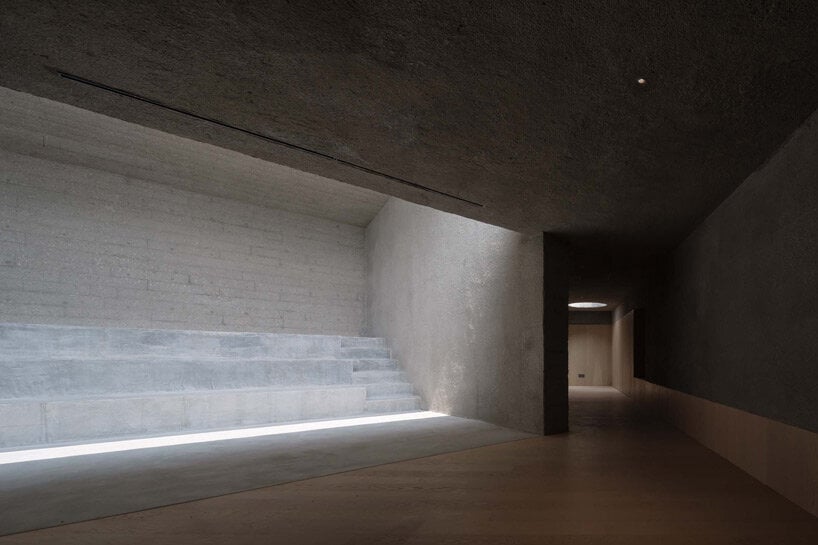
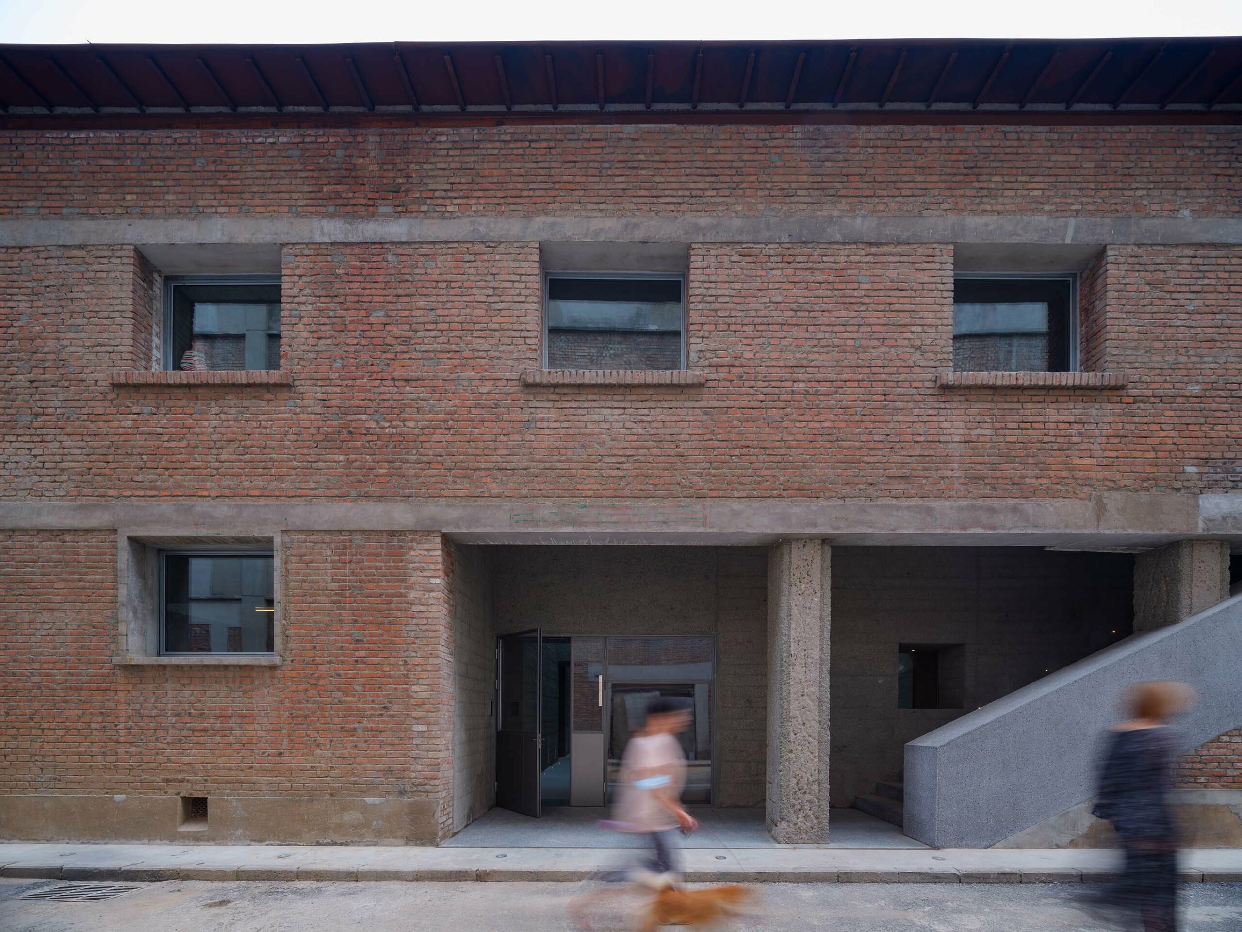
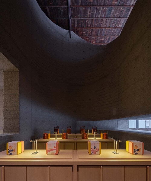
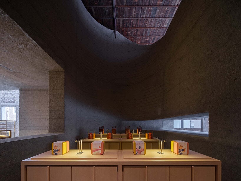
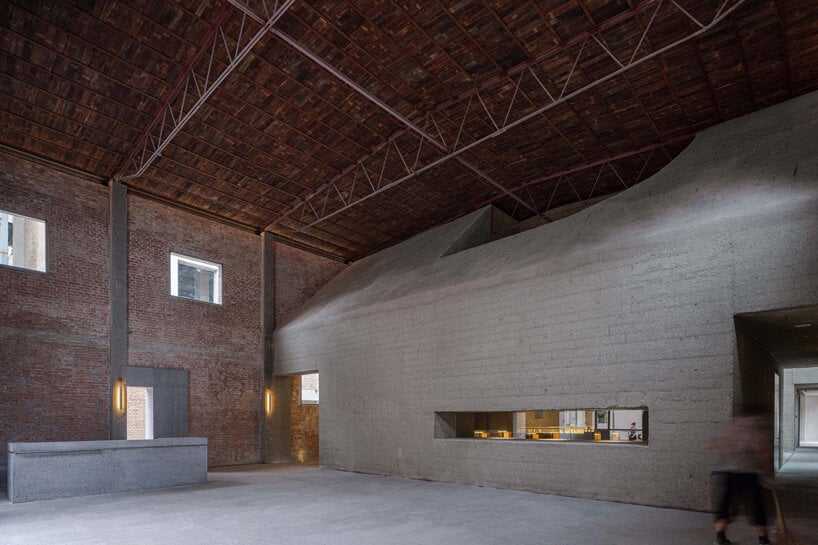
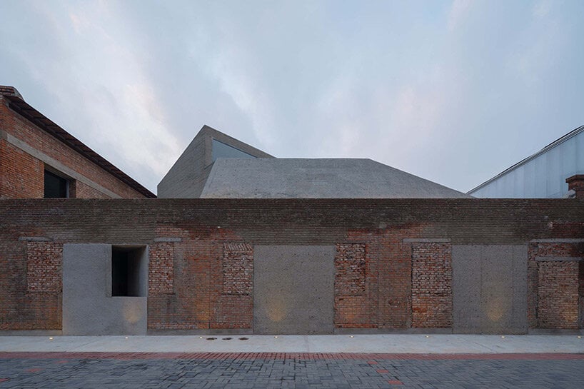
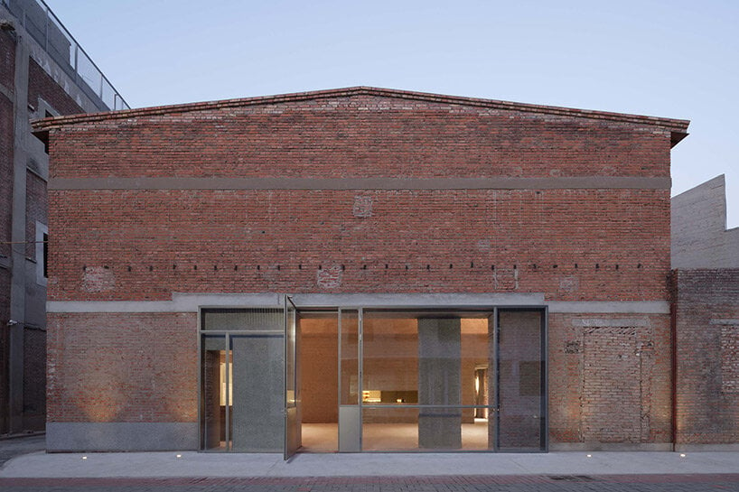
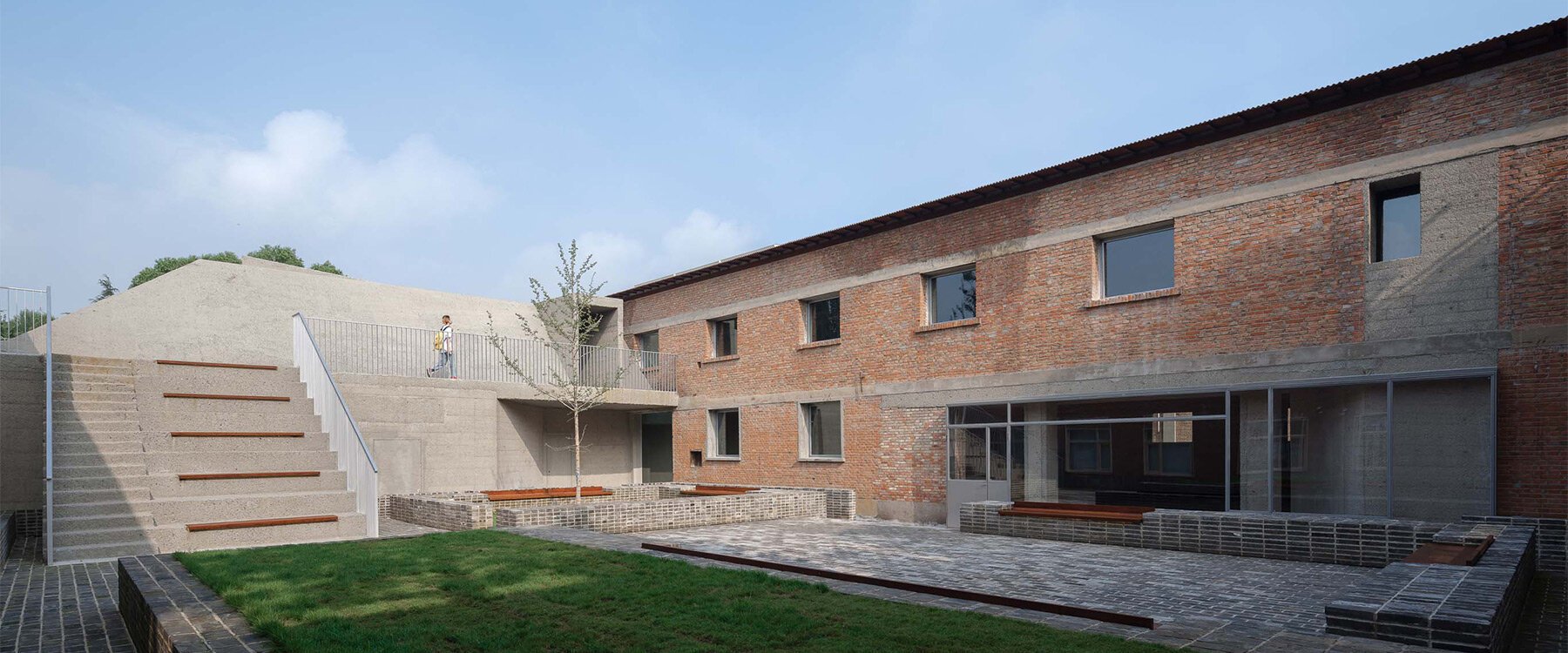
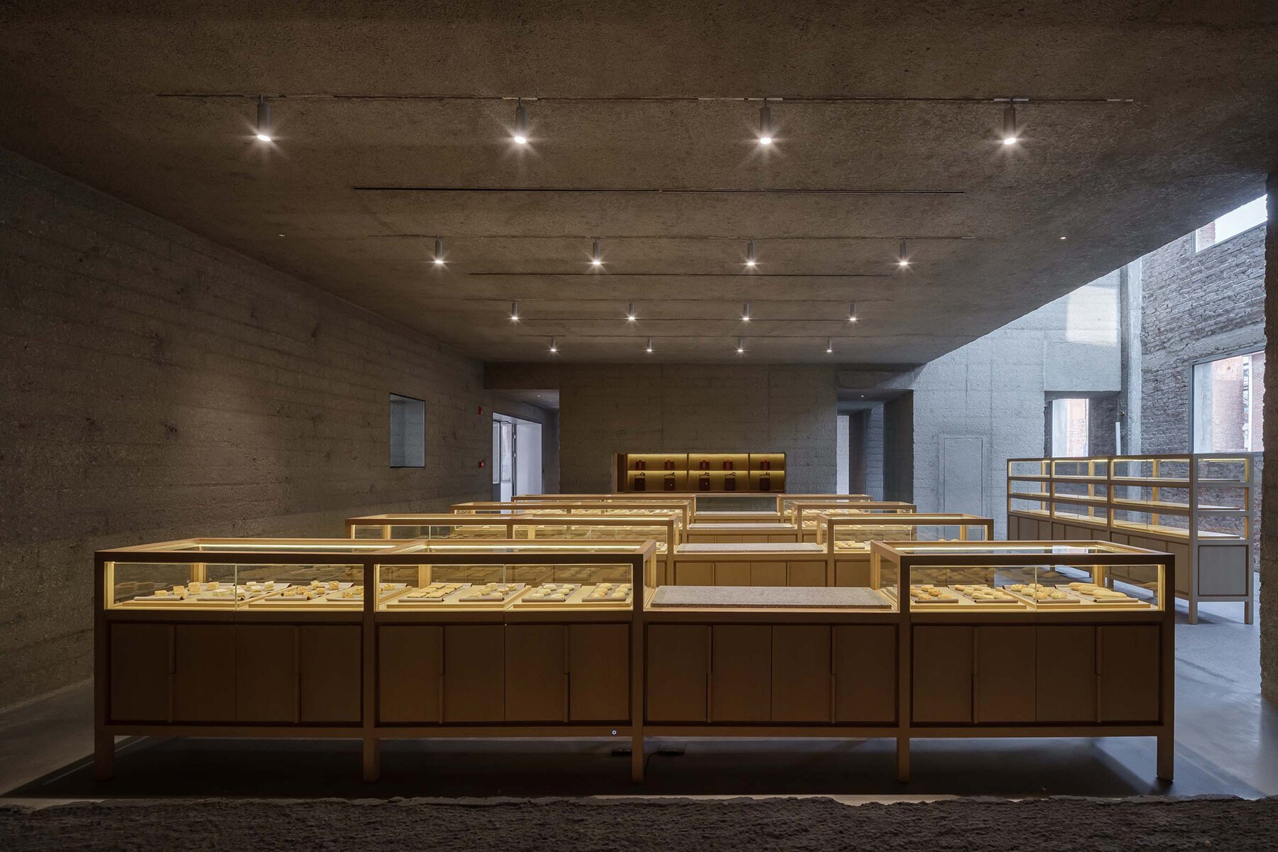
Chinese architecture firm Neri&Hu has completed a concrete extension to an old brick building that serves as the headquarters of Beijing’s historic Lao Ding Feng pastry brand. Located in a previously thriving industrial area, the project renovates the former textile factory consisting of a main warehouse and three outbuildings, as well as a courtyard garden, into a new space with retail, gallery, and office spaces. In their design, the architects have created a clear contrast between the past and the present, while at the same time creating abstract spatial references to the brand’s signature product – traditional Chinese baked goods.
DRAWING INSPIRATION FROM TRADITIONAL CHINESE PASTRIES
The team at Neri&Hu was commissioned to design the conversion of the old warehouse into Lao Ding Feng’s main office and retail concept store. For projects like this, the firm’s strategy is to first thoroughly investigate which parts of the existing building can be preserved and restored, while new additions should not only respect but also contrast the existing elements.
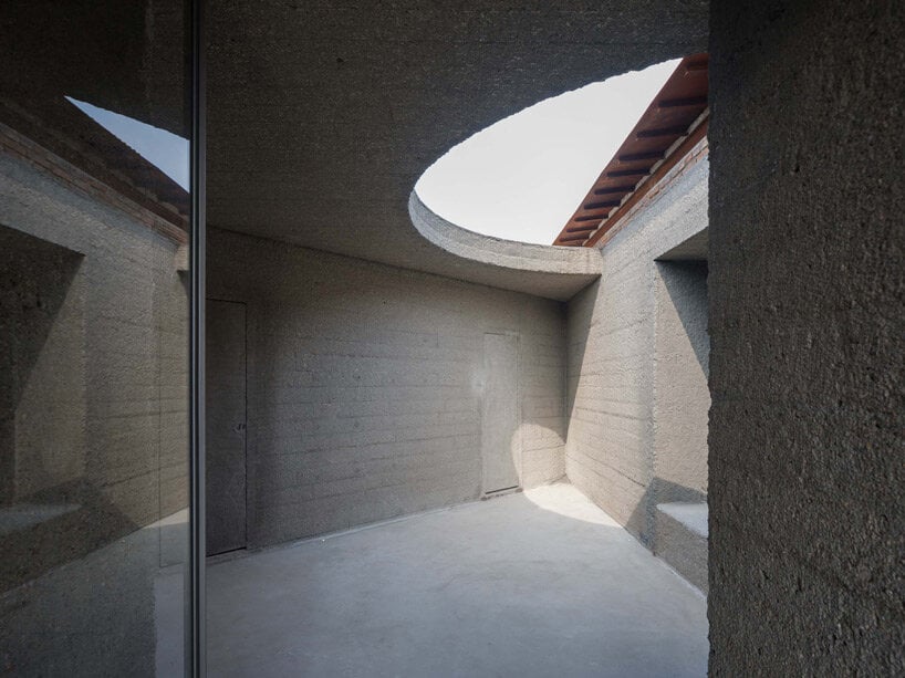
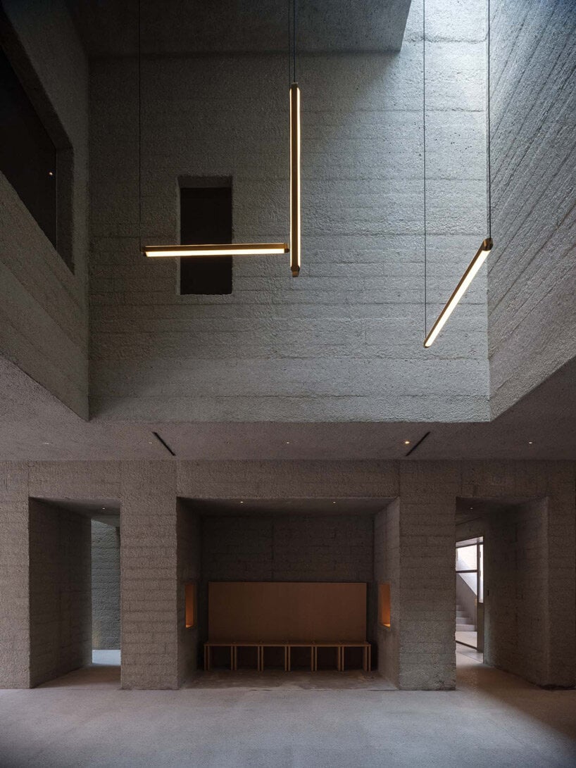
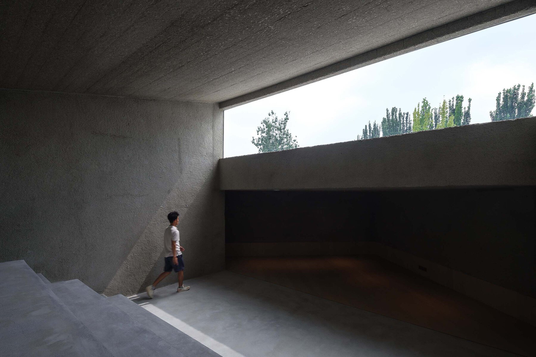
The design is inspired by the client’s main product, traditional Chinese pastries that are often molded into various decorative shapes. The project puts particular emphasis on the idea that a container forms the shape of its contents. Similarly, the architecture introduces a new object made of poured concrete, cast into the old brick shell, with various openings and negative spaces forming the main retail, gallery and office spaces.
A SENSE OF CONNECTION BETWEEN THE PAST, PRESENT AND FUTURE
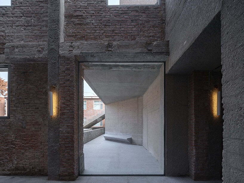
After pouring the concrete and allowing it to cure, specialized craftsmen then bush hammer it for a soft textural quality that both contrasts with and also compliments the old bricks. At certain moments, the new internal concrete seeps out and appears on the façade to fill the voids or mark new access points.
The spaces between the new object and the original shell become flexible areas for a café and a multipurpose hall. The first floor houses the exhibition area, flagship store, garden, and café, while the second floor is mainly used as headquarters. Walking through the new concrete object and experiencing the spaces between the new insertion and the old building convey a sense of connection between the past, present, and future, giving this historic Beijing pastry brand a new home.
from desingboom
'Commerce' 카테고리의 다른 글
| *문하우스 레스토랑 [ Ewert Leaf ] Moonhouse_Senses Aglow (0) | 2022.11.28 |
|---|---|
| *미니멀 인테리어, 에스테틱 메디컬 센터 [ G R A M M E ] Aesthé (0) | 2022.11.23 |
| *코찬 커버드 마켓 [ croixmariebourdon architectures ] Cachan Covered Market (0) | 2022.10.13 |
| *빈티지 코코아 카페 [ T3 Architects ] the cocoa project cafe (0) | 2022.09.30 |
| *인더스트리얼 인테리어 디자인 [ The Playing Circle ] The Eclectic Interior Style (0) | 2022.09.26 |