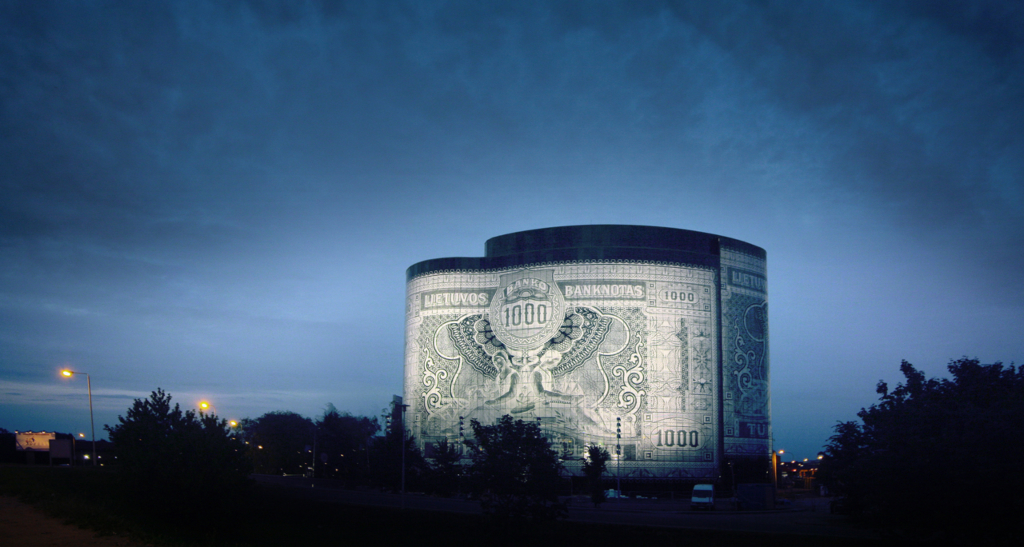
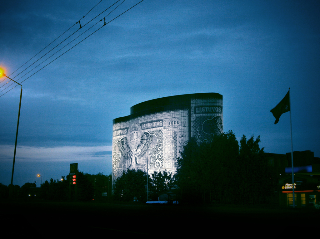
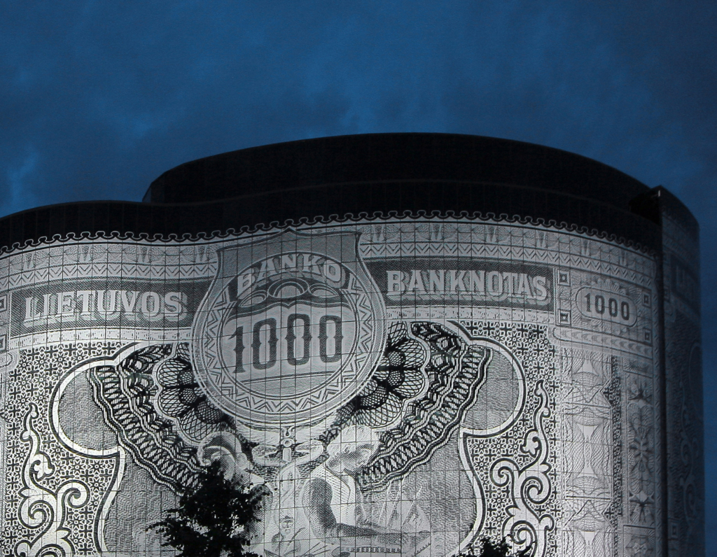
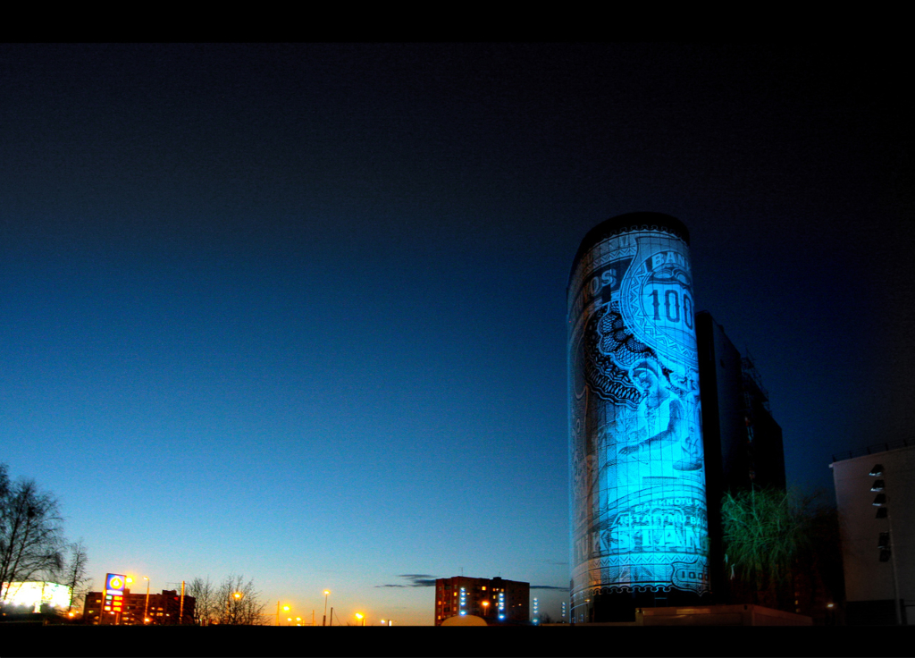
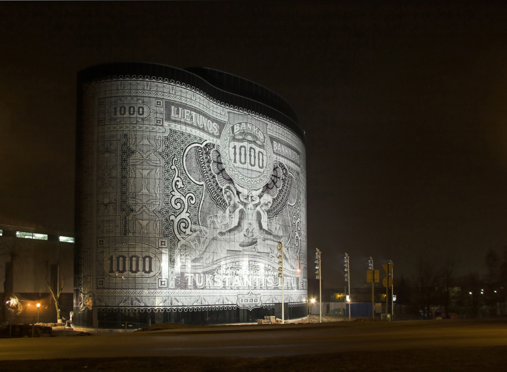
Despite what you might think, this is not a temporal installation. The image of the LTL 1000 banknote is brought onto this 10-story building using special enamel paint. During the process the paint turns into a ceramic print that lasts forever.
At least in the Netherlands all literal prints on buildings are temporal. (Architects only apply abstract patterns to their designs.) The literal prints are small in size and last only for a short period of time. They depict for instance a popular soccer player during the European Championship. In the city of Kaunas, Lithuania, the commissioner and architect however had the courage to design a literal print that sustains. The façade consists of 4500 glass panels in different shapes, manufactured by Saint-Gobain in… the Netherlands.
‘Jonas Plenta, marketing manager of Urmas, the company behind the project, insists that the new structure is not simply a mighty monument to the power of money’, the Baltic Times writes: ‘“At around the same time we were assessing some of the design projects for a new office building in 2005, Lithuania was one of two new EU member states applying to join the euro zone. We happened to come across a very elegant banknote dating from 1925, and decided to use it as our overall theme.”’
The architect, RA Studija, adds that this particular banknote came out between the two devastating world wars during a period that Lithuania was independant. It is a virtuous image.
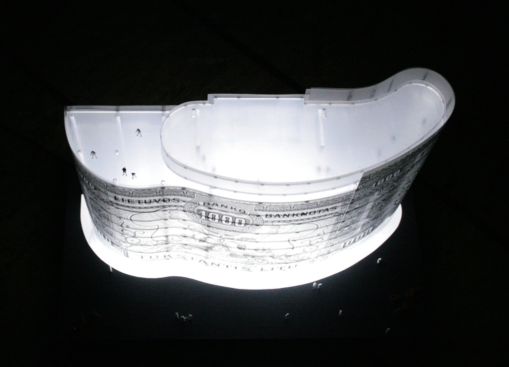
What fascinates me is that the iconographic screen (the building) is flat and that the source image (the banknote) is flat too. The translation from the source image onto the building is incredibly simple: scale, fold: done.
It is one of the simplest iconographies documented on Eikongraphia, if not the simplest one. Usually the image is abstracted and distorted. Not here.
With its form the project stands somewhere in between the Duck and the Decorated Shed, as defined by Robert Venturi and Denise Scott Brown: the image is applied to a screen (Decorated Shed), yet also folded into an object (Duck).
This in-between position typifies the current architectural practice, Hal Foster argues in his essay in the book ‘Architecture between Spectacle and Use’. The Walt Disney Hall in Los Angeles and the CCTV Building in Beijing are ‘Decorated Ducks’, he writes. Dietrich Neumann though once declared at a lecture that “the Ducks have won.” Who is right?
It is striking that two major banks from Lithuania have rented office space in the banknote-building, SEB and Snoras Bankas. How amazing is that! With these tenants the façade suddenly has become representational. It is like a self-fulfilling prophecy.
I wonder: Could a concentration of banknote buildings support the emergence of a financial district? Do buildings with gigantic LED-screens as façade attract media companies? Do IT companies favor technically looking buildings? Are locations next to highways popular with car companies? And why do so much architects work from old buildings?
Returning to the temporary prints with which we started: what about glass buildings with another print every season? You just refresh the stickers. If properly done, an architecture could emerge that would be forever fashionable, or at least for half a decade. How sustainable would that be! Why haven’t architects been exploring this idea?
'REF. > Architecture' 카테고리의 다른 글
| [ J. MAYER H ] Mensa Karlsruhe (0) | 2008.10.03 |
|---|---|
| [ Vitruvius ] Barcode (0) | 2008.10.03 |
| [ MAD ] Superstar (0) | 2008.10.02 |
| [ J. MAYER H ] dupli.casa (0) | 2008.10.02 |
| [ UNStudio ] Louis Vuitton (0) | 2008.10.02 |